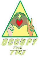
We eventually agreed on a design that I believe reflects our most important guiding principle - our need to love for and care about each other on a deep primal level. Even this wonderful design presents a challenge. The design continues to incorporate traditional symbols of resistance and peace. But the centerpiece shows us joining together, devoted to a more loving world.
We live in a society where branding is deeply ingrained behavior. We all know golden arches, and sneaker swirls. We tend to know corporate symbols better than even basic rules of language and etiquette. So it will take time for our new logo to catch on with the public. It will definitely take time for our principles of love and nonviolence to capture the public spirit.
Similarly, I have been reconsidering another traditional symbol of resistance and revolution, the anarchist Circle A. This symbol is certainly not as widely known as countless others in our society, and this particular symbol has been used in wildly different contexts and for differing purposes. I imagine for a lot of people, the Circle A represents violent bombers or punk rockers, carrying a heavily negative connotation.
But, I believe it time to revisit this historical association of the symbol with the violent overthrow of governments. Gandhi, perhaps humankind's leading proponent of nonviolence and proponent of the overthrow of oppressive order once wrote:
"The ideally non-violent state will be an ordered anarchy. That State is the best governed which is governed the least."
Anarchy India has an excellent blog posting on how Gandhi's vision of anarchy would be applied. Gandhi felt that the State represents violence in a concentrated and organised form - a soulless machine that can never be weaned from the violence to which it owes its existence. Is Gandhi’s ideal of a non-violent state of enlightened anarchy where social life would remain self-regulated a pipe dream - an impossible utopia? I have no idea who said it first, but many noteworthy people have expressed the sentiment.
“The impossible is what nobody can do until somebody does”
So, while I know the Circle-A symbol has some well-deserved baggage (perhaps no more or less than many other commonly accepted images), I think it has value and deserves to be reclaimed. The anarchy symbol is a direct and obvious statement that an existing order is dysfunctional and must be replaced. For those of you who are into the origins of words, the word "anarchy" comes from the ancient Greek ἀναρχία, anarchia, meaning "absence of a leader." Well, isn't that at the heart of the Occupy Wall Street movement?
Anarchy can be nonviolent. Society can exist with laws but without corrupt government. It will not be easy - in fact it may be very nearly impossible - but we can build a human society based on love. We've spent millennia building one based on fear and hate, so how hard can it be if we put the same energy into positive emotions?


4 comments:
"Occupy the Tri"? Beautiful!
Yes, I should have clarified. After beginning lives as separate Occupy movements in Saginaw, Bay City and Midland, we merged to form Occupy the Tri last December. Our General Assemblies rotate weekly and we work to hold direct actions in all three cities, along with connecting with students, faculty and staff at Delta College and Saginaw Valley State University.
I like the art. That was what I was saying!
IMHO, elegant & meaningful logo chosen, will attract more supporters & will scare fewer people away than clenched fist or Circle A.
Post a Comment